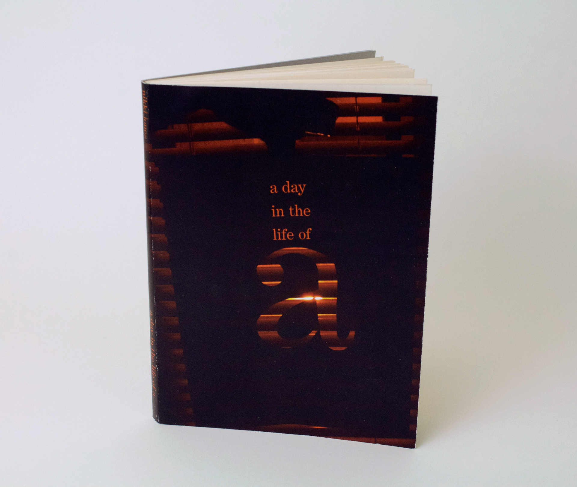
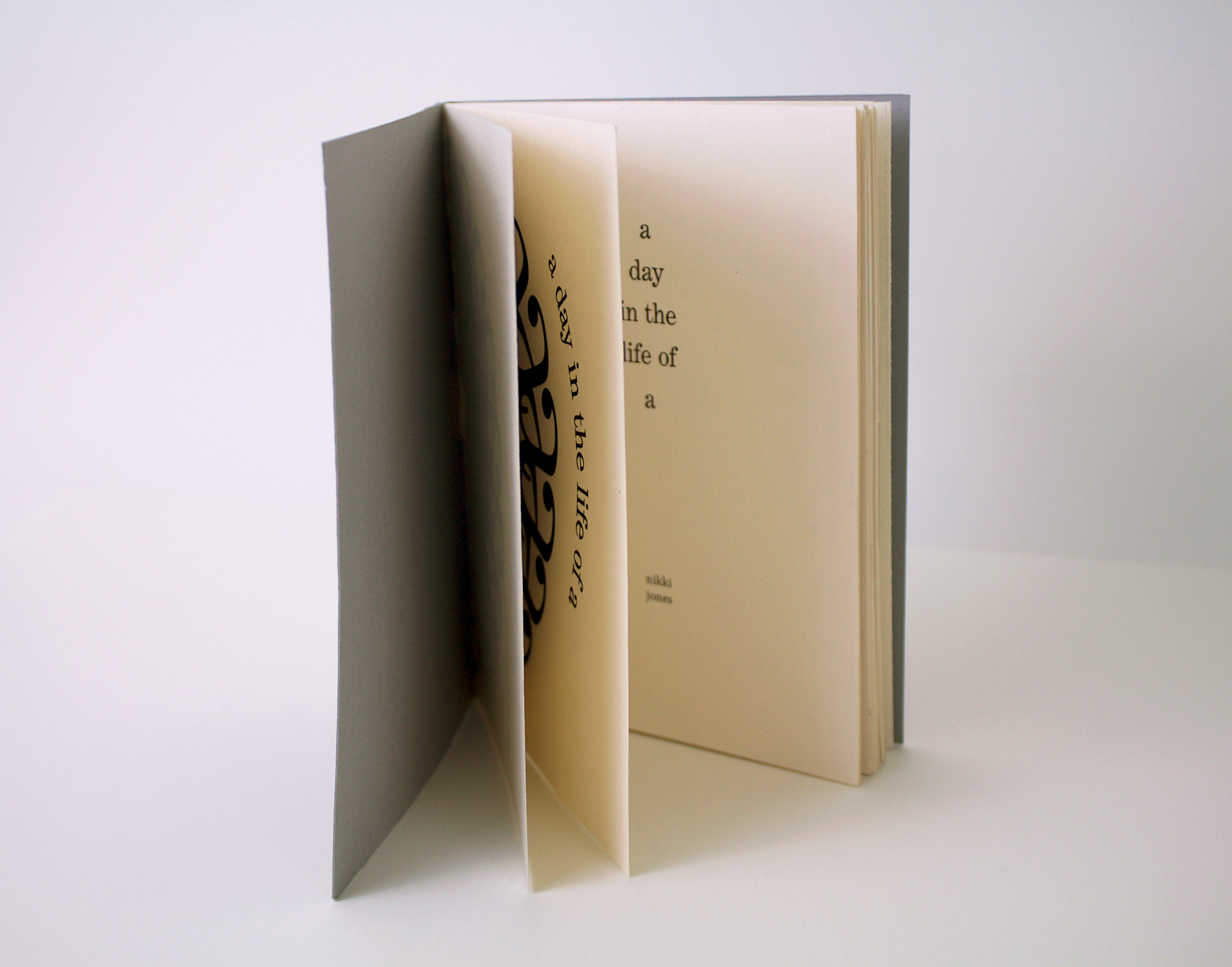
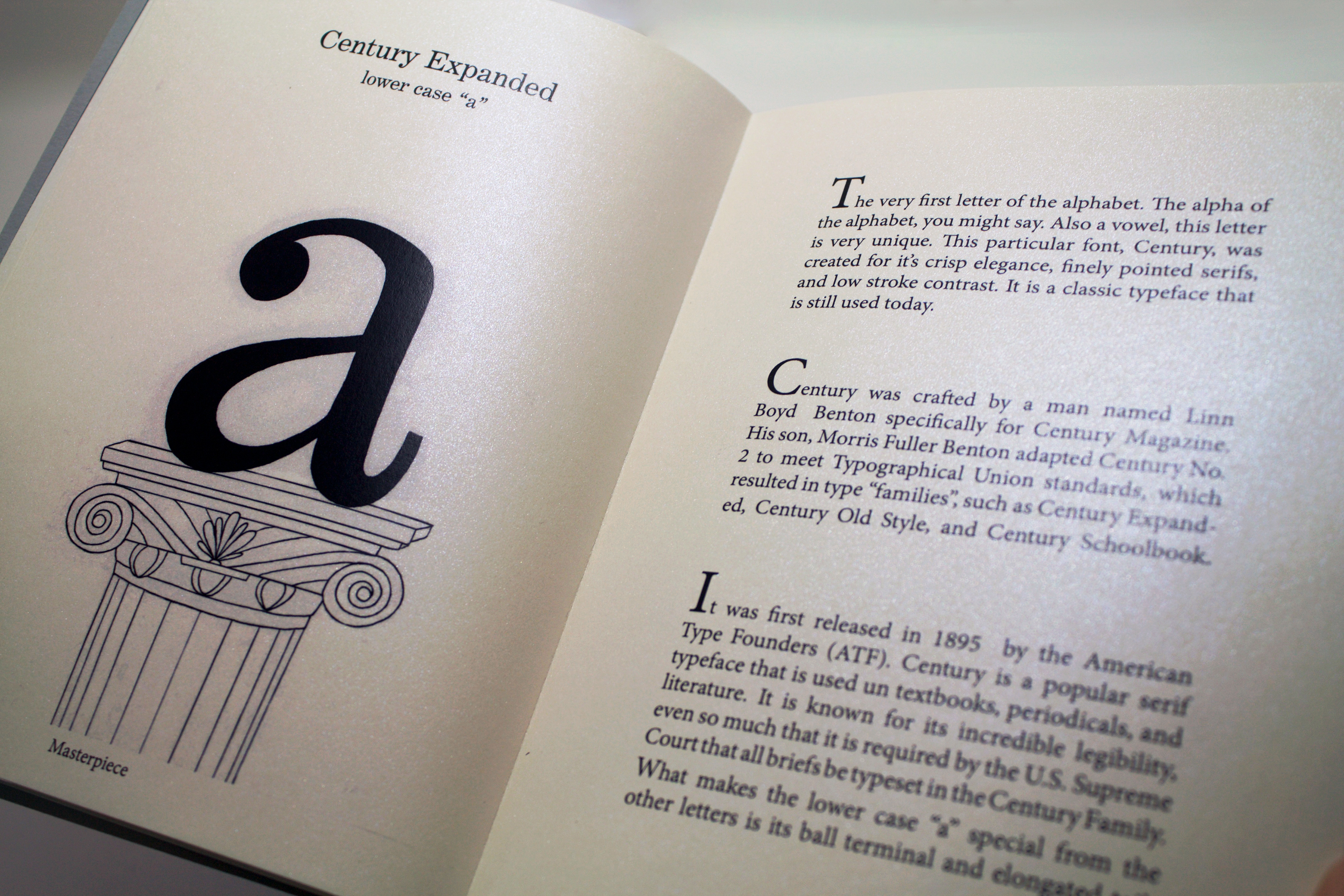
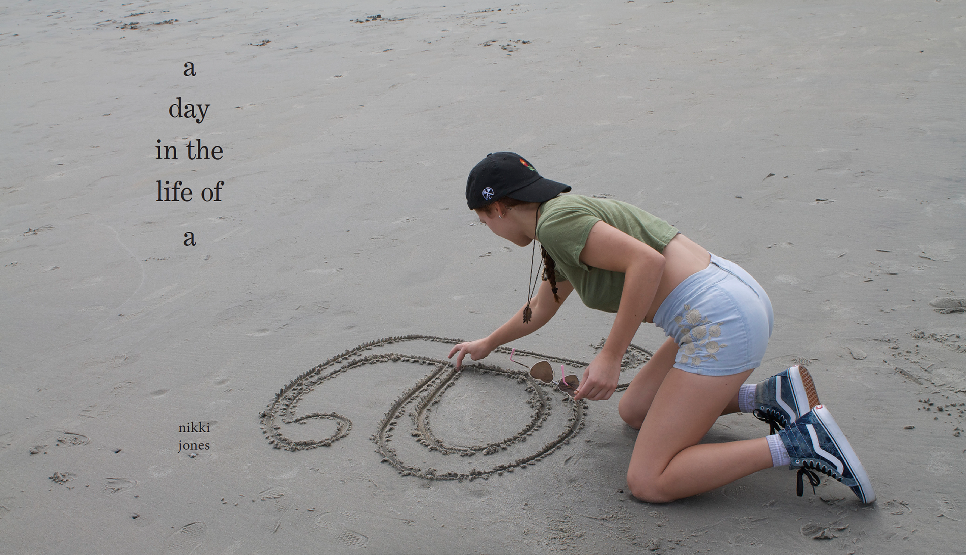
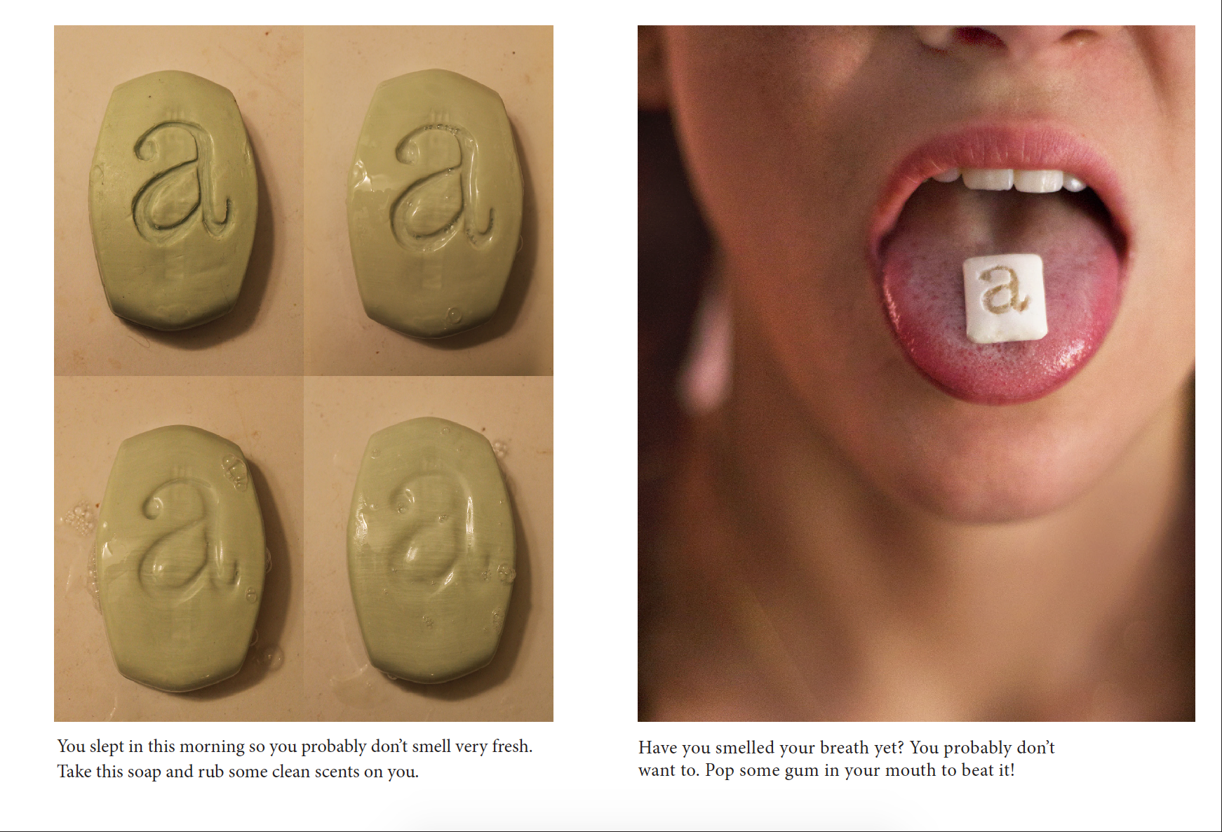
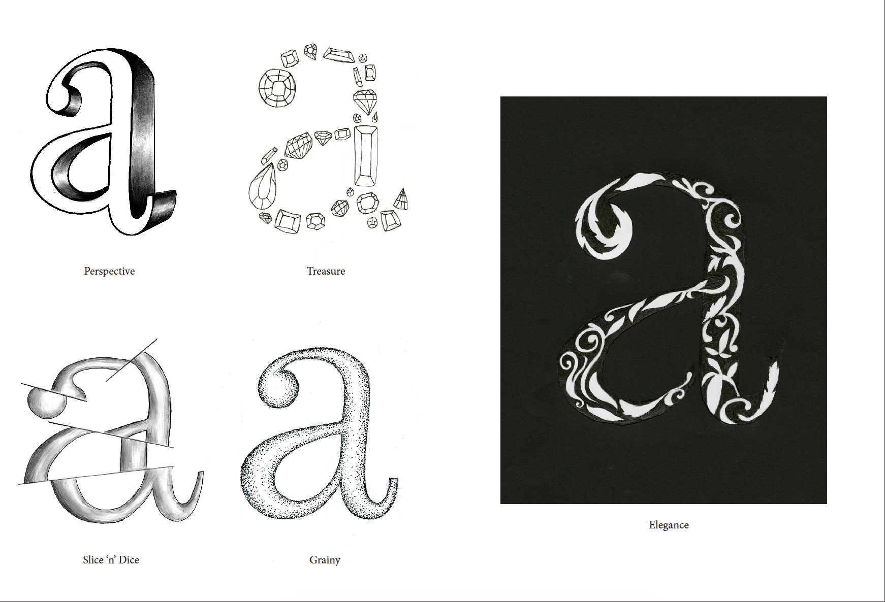
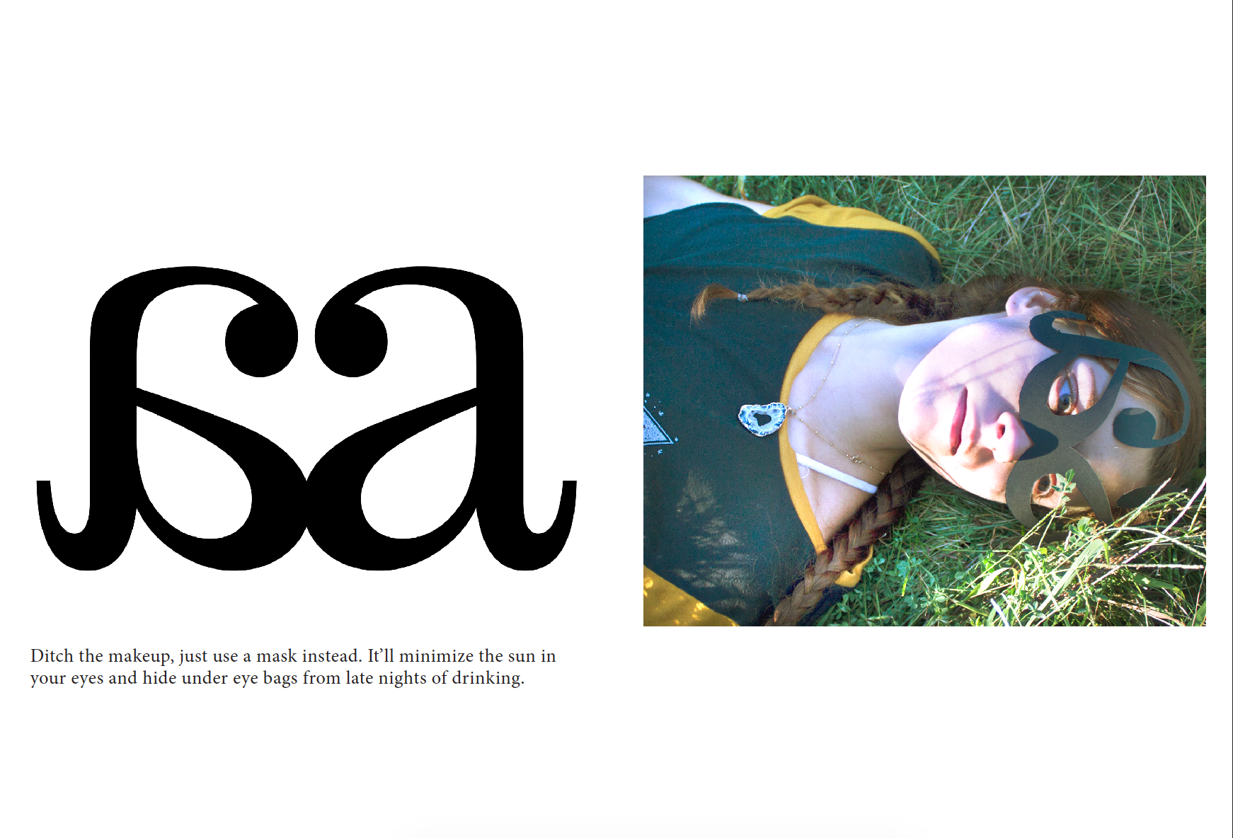
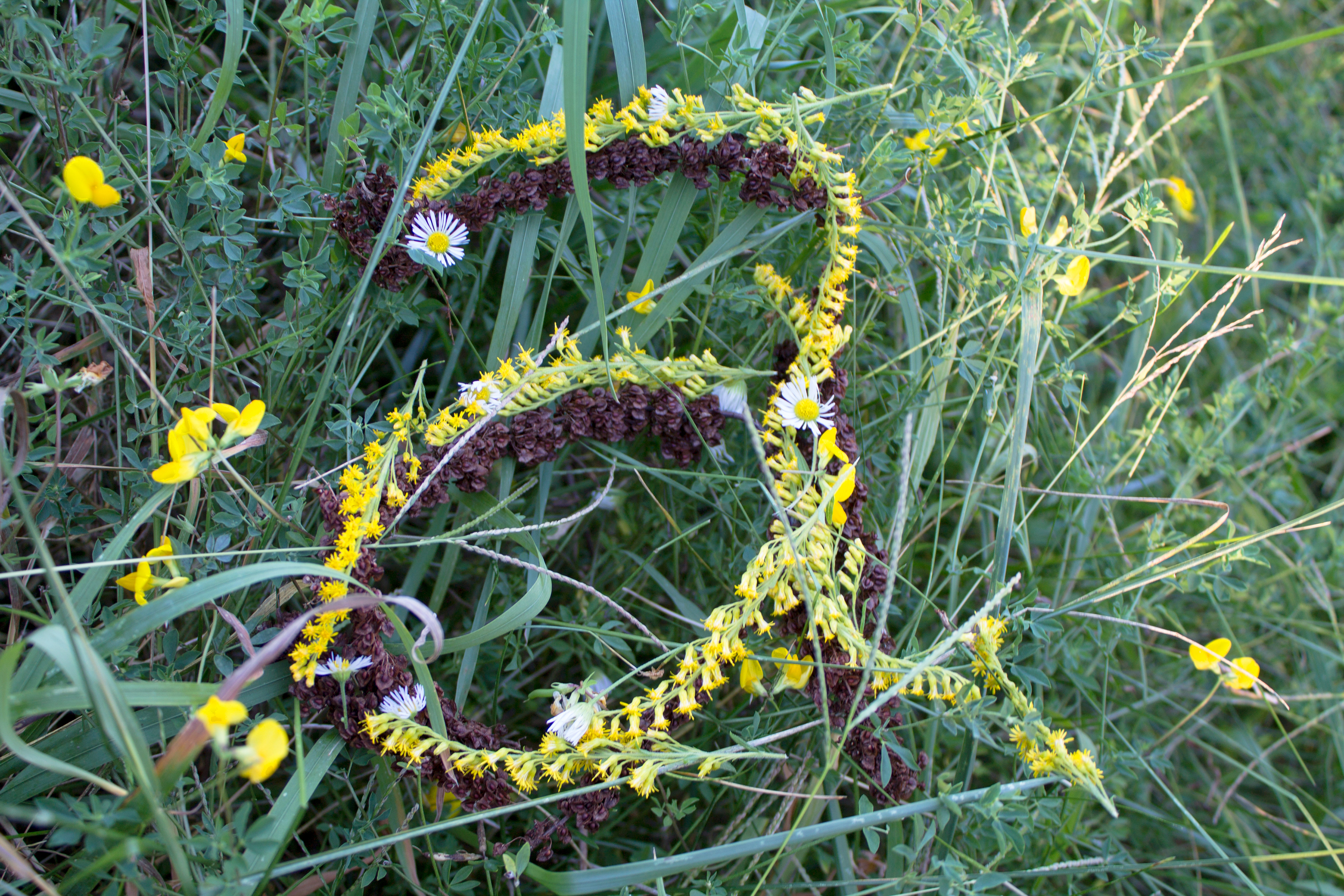
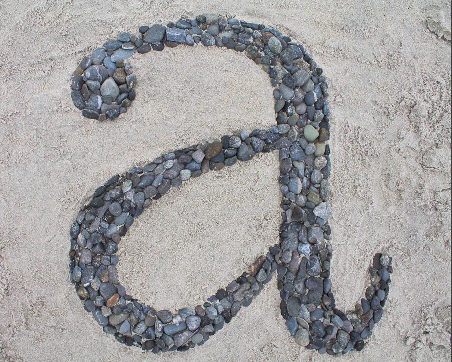
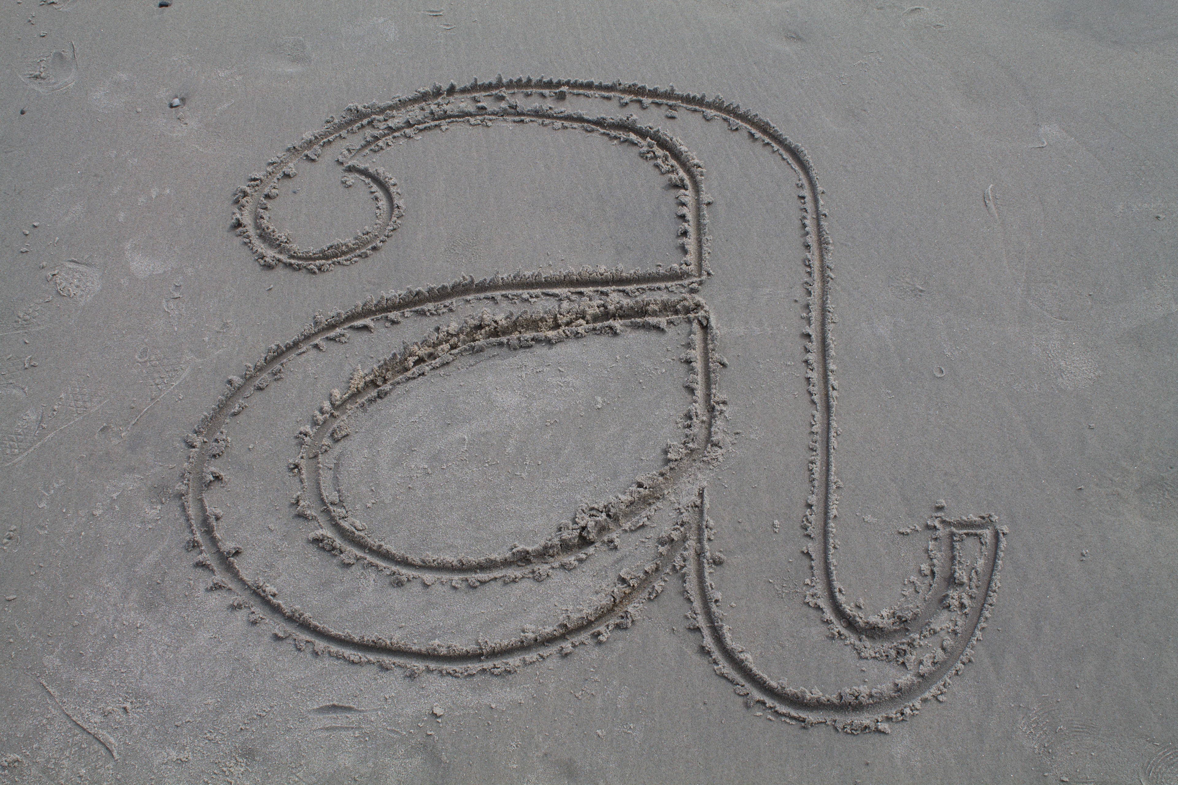
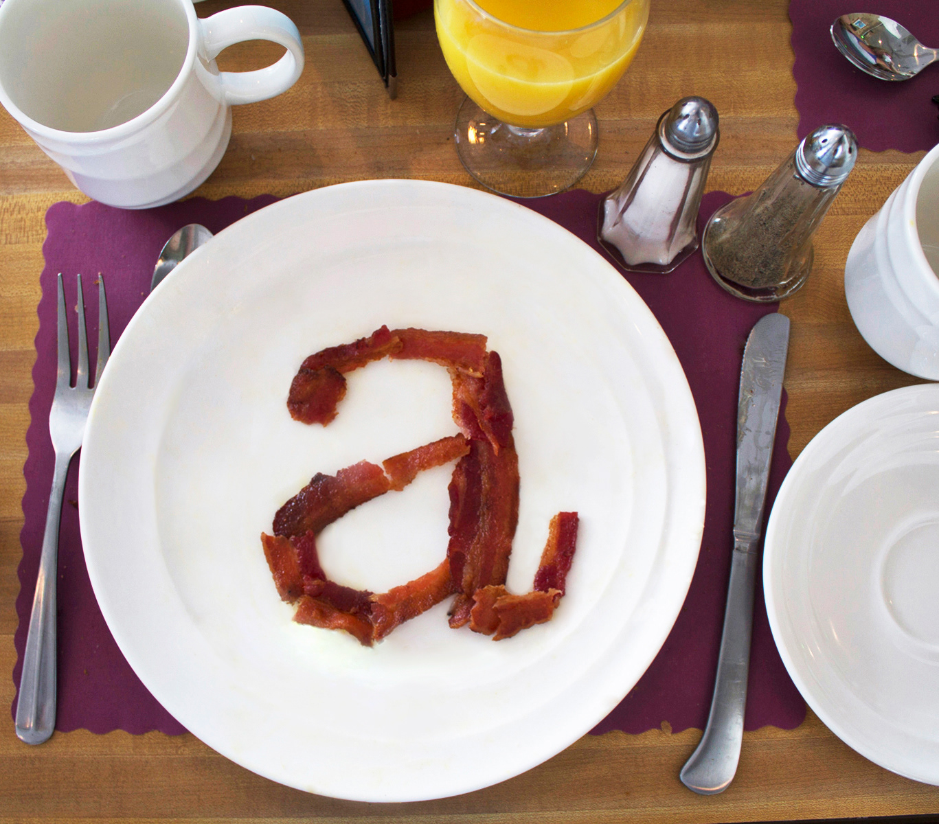
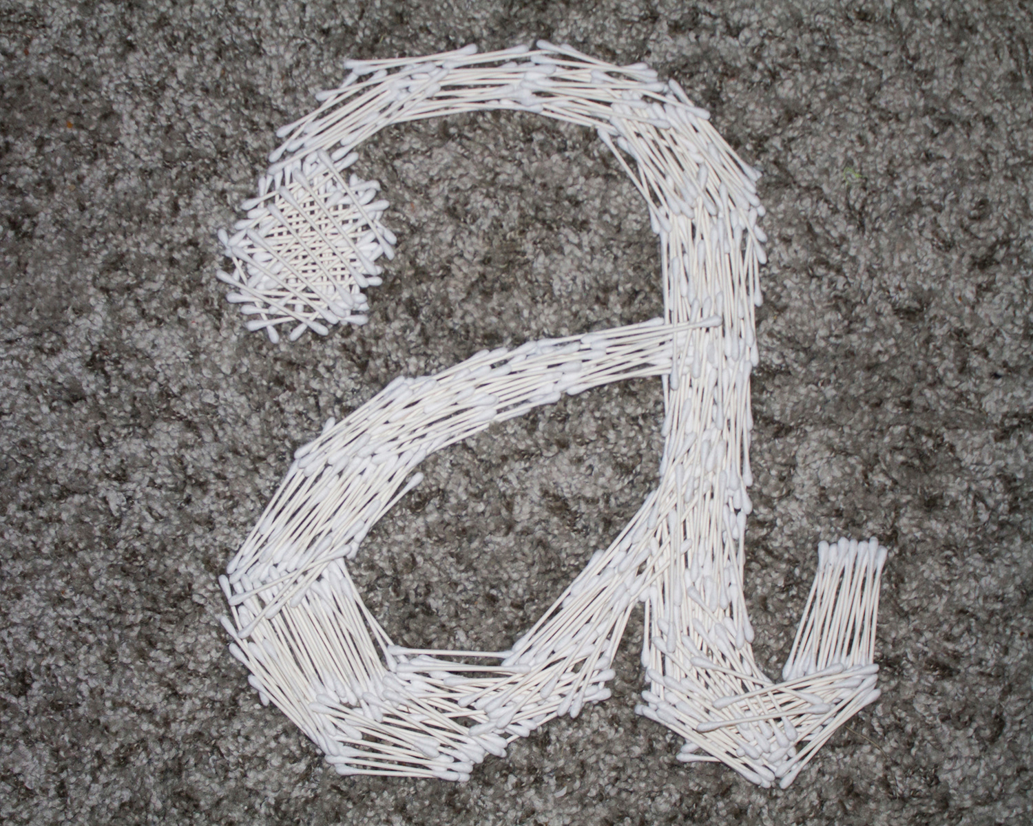
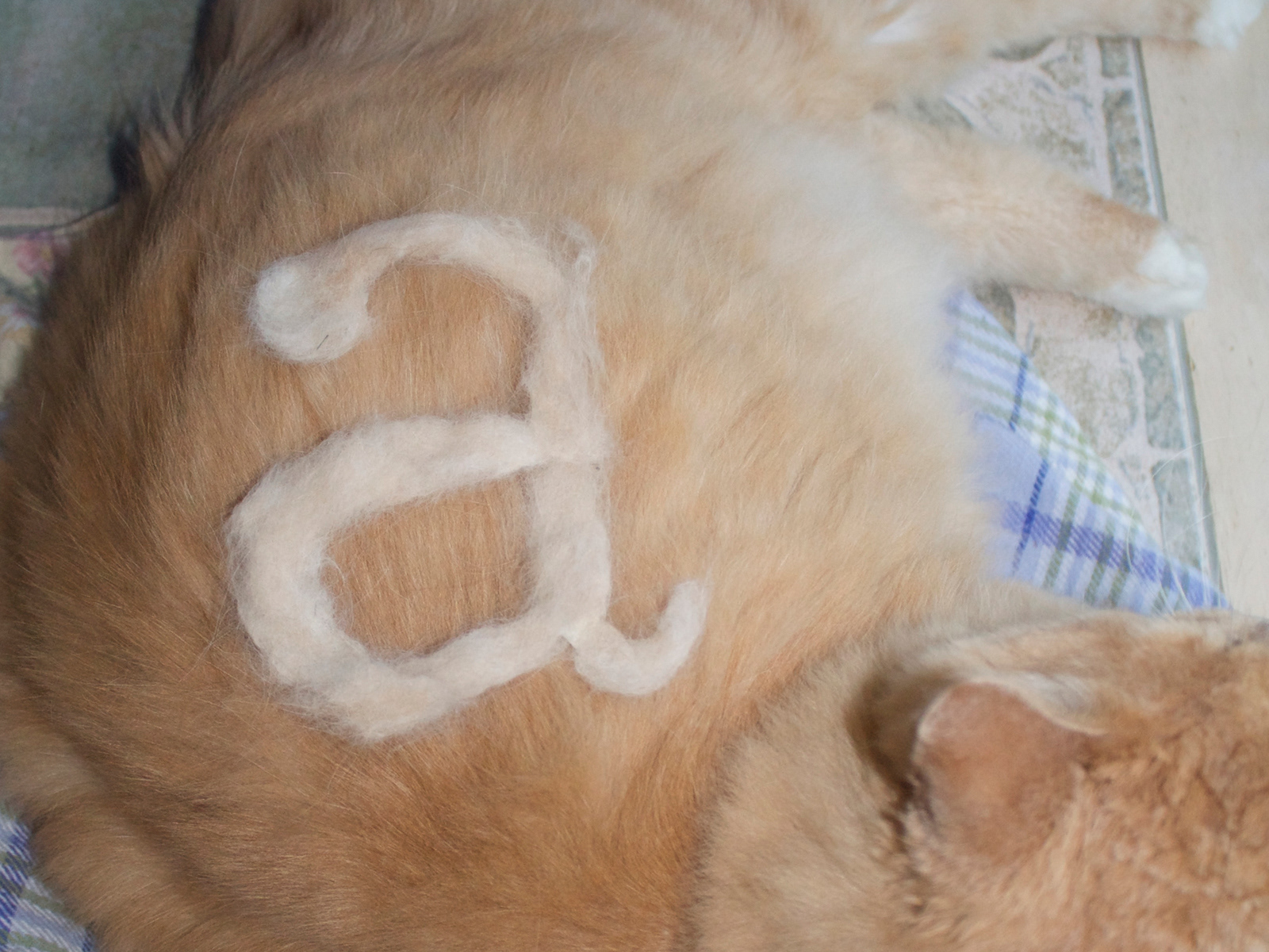
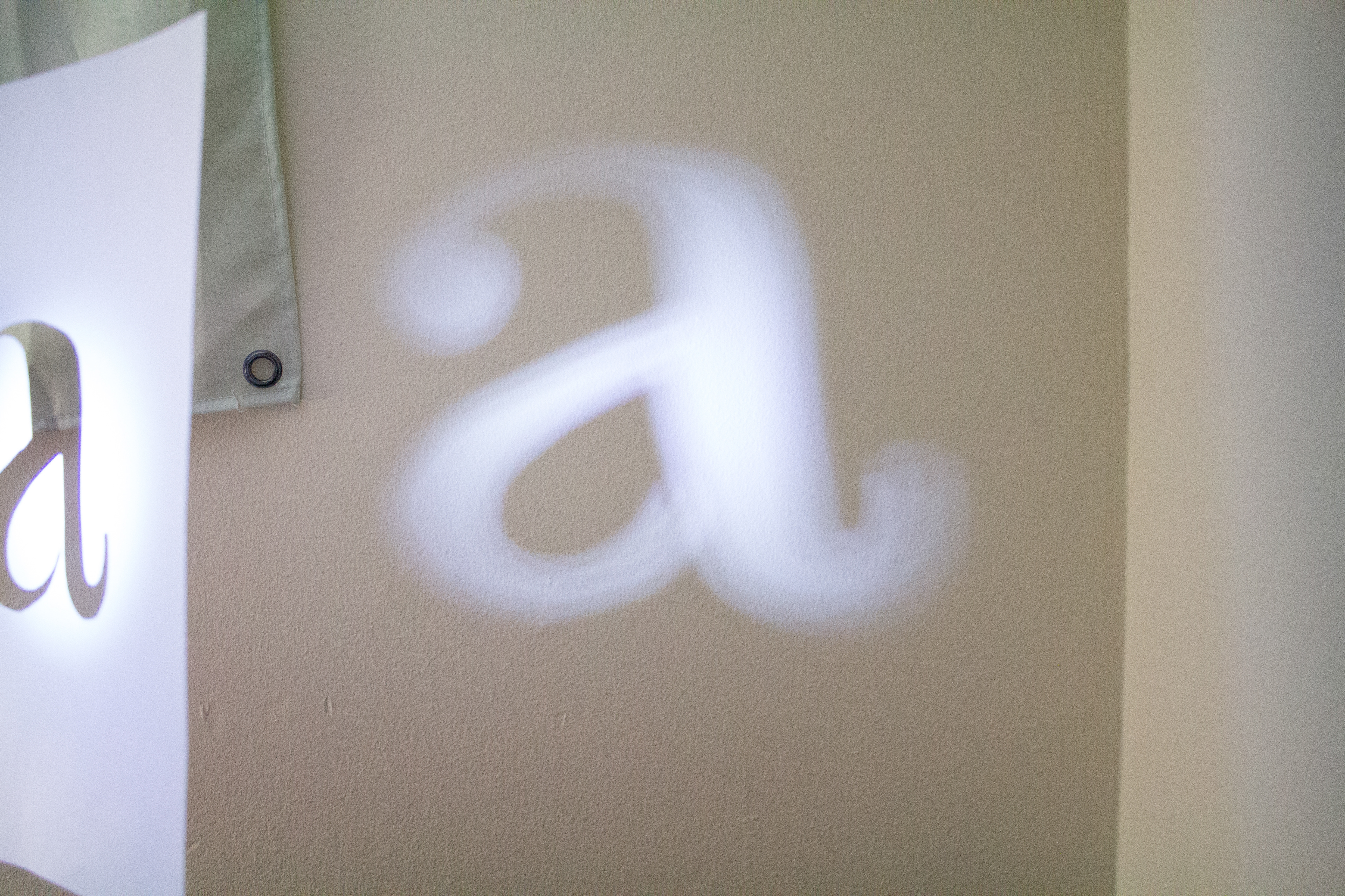
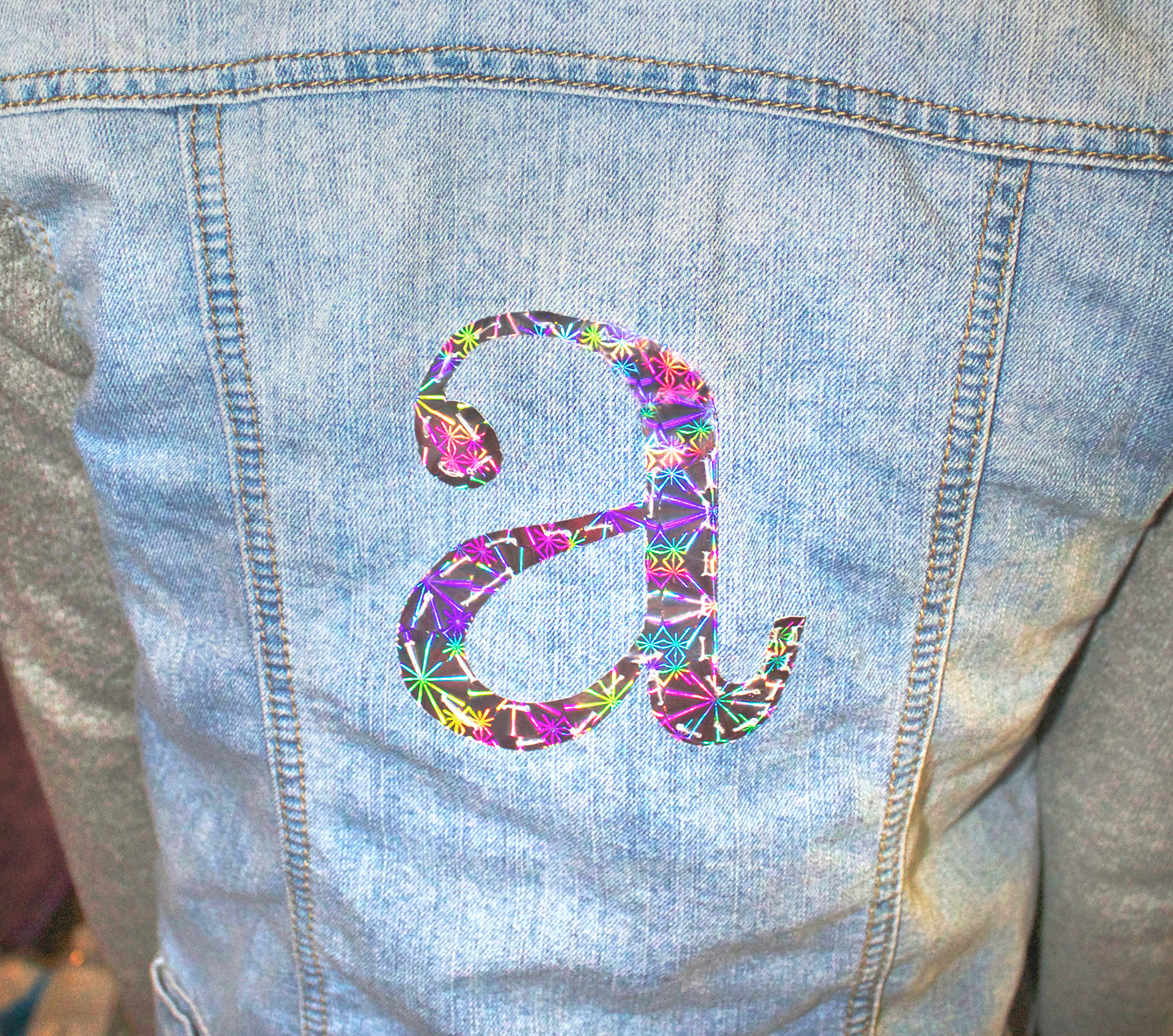
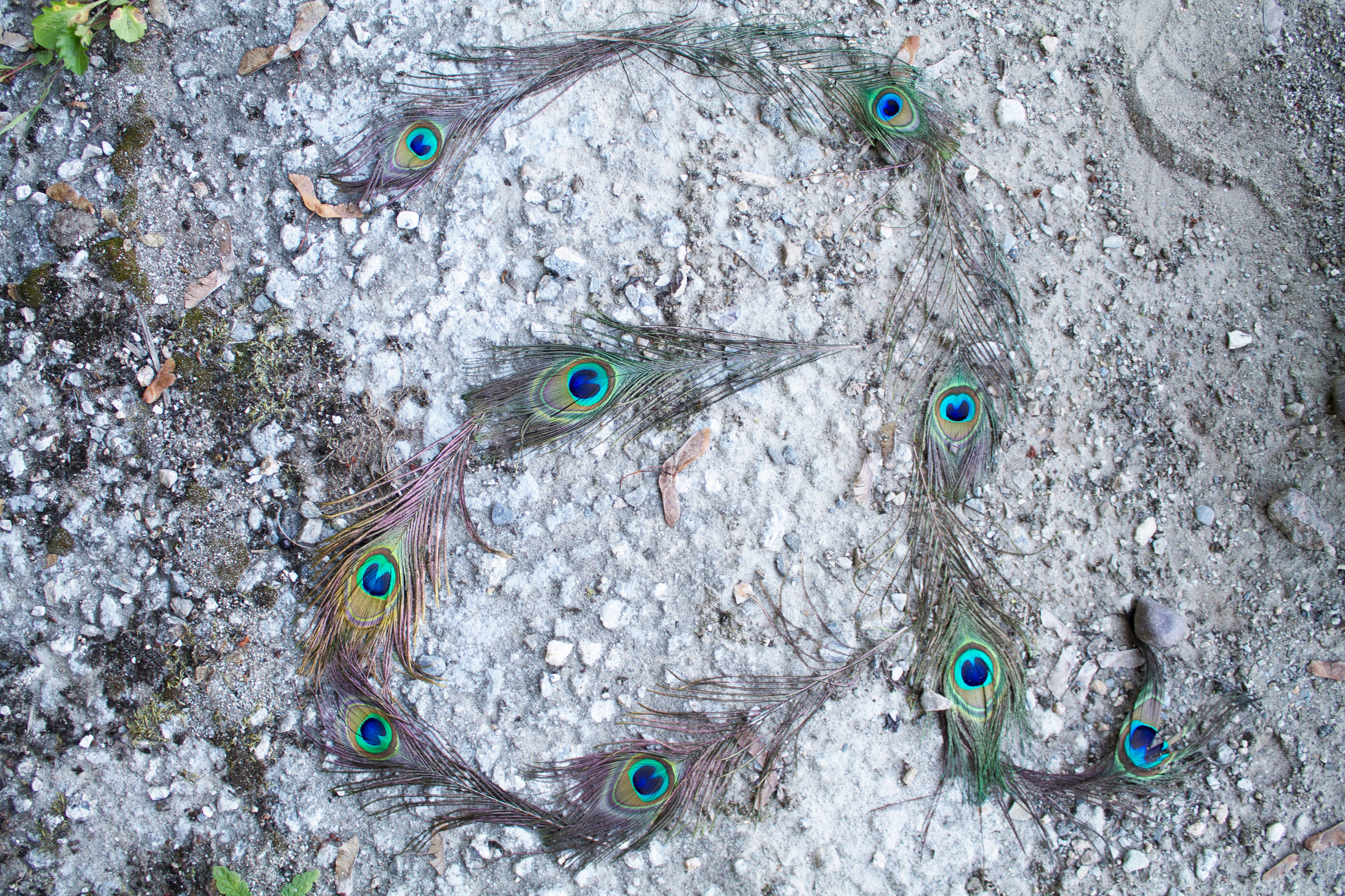
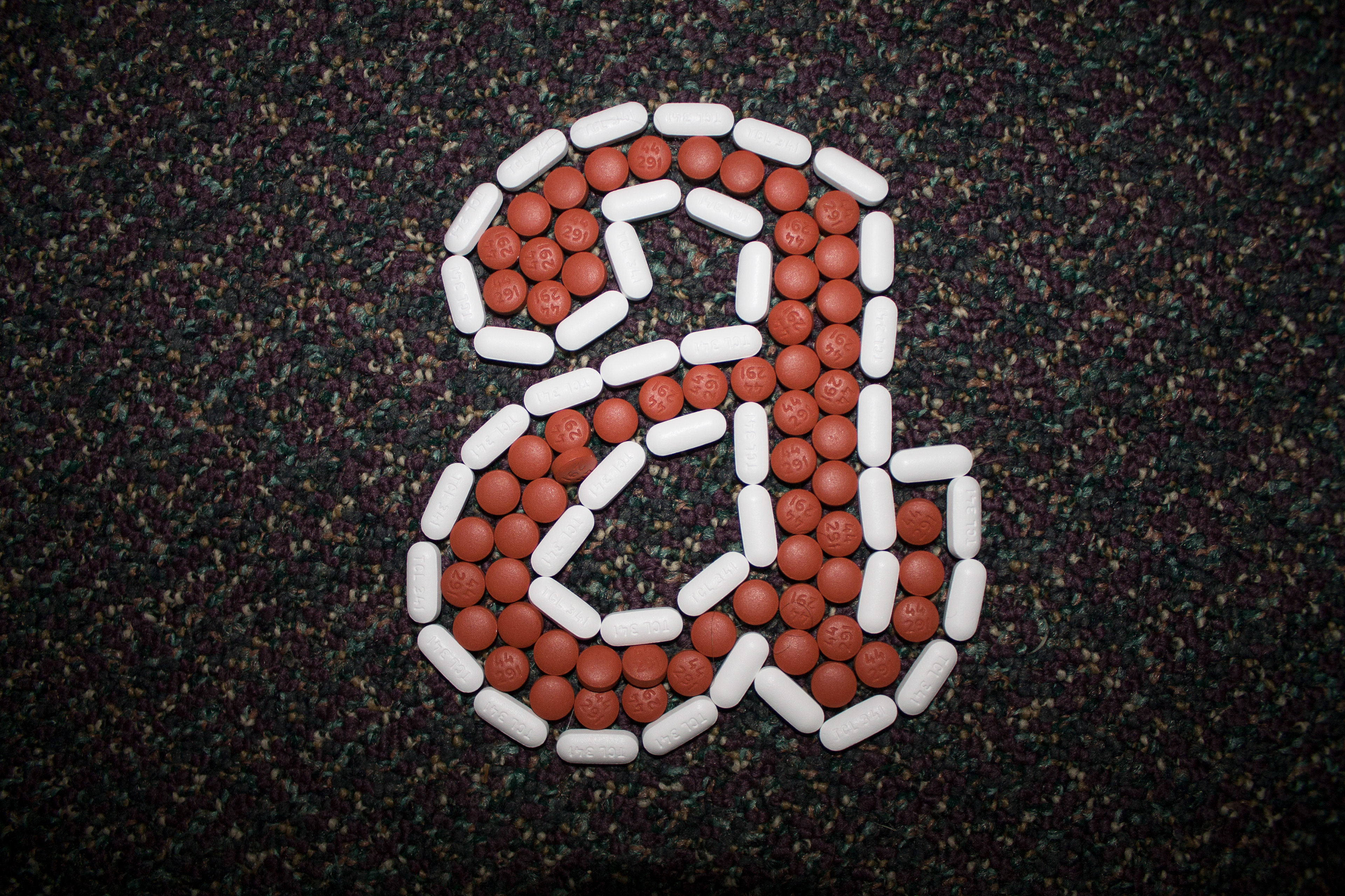
How many different ways can a letter be represented without losing its recognizability? This book explores numerous typographic experiments of Century Expanded’s lowercase “a” using two and three dimensions and both digital and traditional media. While designing the inside of the book, I wanted it to take on the layout of a young children’s story book. I love writing so I really enjoyed creating a narrative for these typographic experiments, and got to know the typeface Century a lot better. The book begins with an all American breakfast and cleaning your ears, showing the reader the individual’s perspective and experience. The book is meant to be read through one’s one eyes, as if it’s a day in their life.I wanted the story to be a way for the reader to connect with the letter.
This project really opened up ideas in my head regarding type and representing type with every day objects and materials. I enjoy the fact that design can happen anywhere, any time, with any unexpected assortment of items.
Book Design, 2016. Adobe InDesign.